Oh, homemade cakes. Ugly, but heavenly good. Made with heart.
Bad Shopping mall cakes. Elegant looking, tempting all your senses, but then tasting horribly sweet. Made to profit. Unhealthy in the long run.
Cakemail is a Canadian email marketing tool fitting mostly the design/webshop mailer category. Let’s find out which one is it, the homemade or the horrible.
First taste
The first impressions UX-wise are quite tasty. Cakemail is clean and polished using pleasant low-hue greenish colours and a healthy amount of whitespace.
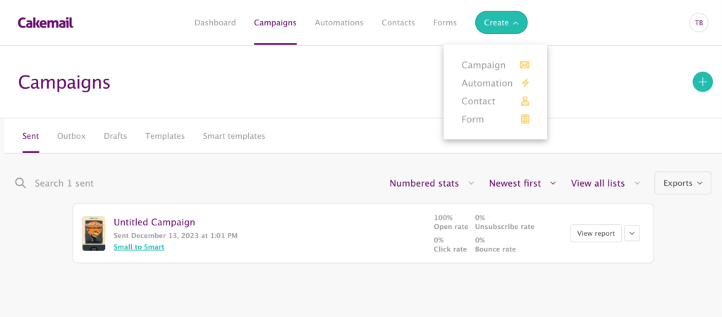
I loved the layout and the menu organization. No endless nested submenus – the main categories open up a thoughtfully organized secondary line where you do the work.
The settings are nicely packed under the little name icon and organized logically. You would think, that this is UX 101, yet there is quite a handful of mailers when these 1-time setting elements are all over the place.
I also appreciated the quick create options on top, and inside every tab. -1 click at any time is a small win.
Took me some time to find the tags
The one thing I didn’t like in the org. is that they hid the tags under that setting area, completely separated. Why it’s not in the contacts tab? I also missed adding tags from any selection on the go, if it doesn’t yet exist (ie. in automation, filters etc.)
Bugs in the Cake
Tasting the cake further, some less likeable flavours started to creep in.
The Form is this one. Period.
The form editor is surprisingly limited with no way to make any stylistic changes. I can’t seem to find any redirect or a way to edit the confirmation email.
I’m fine with that as I’d embed it via HTML to a more customizable Thrive form. But if you don’t want to use a 3rd party tool, these forms will not blend in.
The confirmation and redirect…that’s a bigger deal. Controlling the first impression is important and I’m using all three, as integral parts of the welcome: the thank you page, the confirmation mail and the page after they clicked.
Automations – are a pain to look through
After a strong impression of the front-end design, I was expecting some nice, elegant canvas with tasty buttons to set automation. Something like in Audienceful.
Well. Not so lucky.
The automation UX is poorly designed. The elements are just out of proportion and you never really see it through properly because half the screen is covered by the settings that you can’t close.
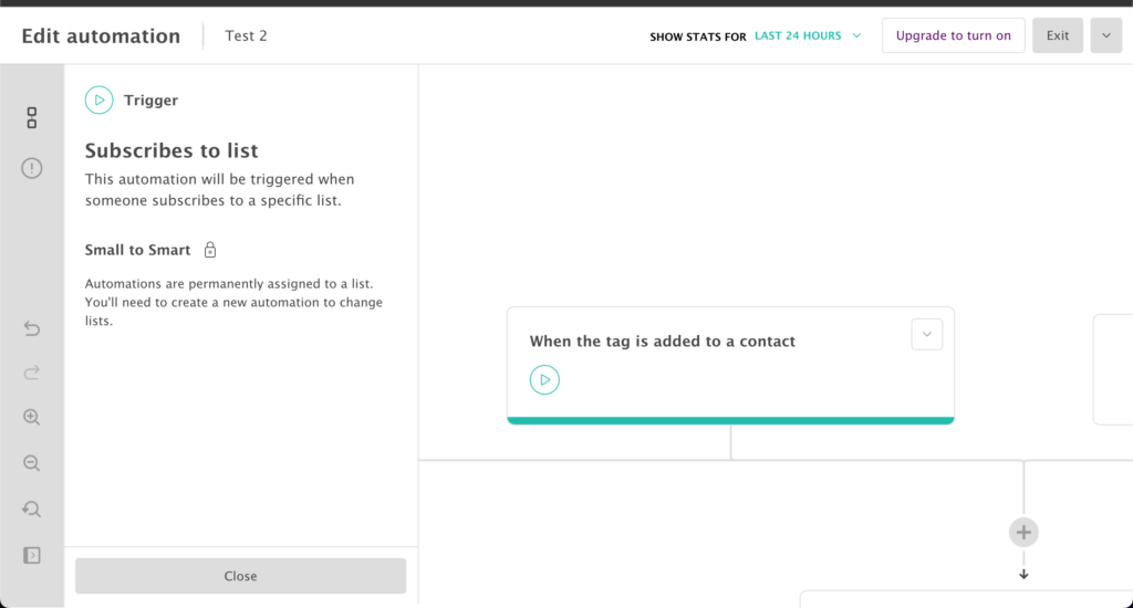
The fixed triggers just being there are also weird, the useless grey bar on the left, that doesn’t zoom it in any usable way…
It could – and should – have been made much better, it’s pretty well figured out by now in the industry.
If you zoom in, you are scrolling left to right just to try and see what is going on. But if you zoom out, you can’t see shit.
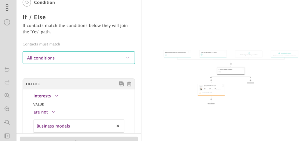
The free and lite plans give you drip emails – which is fine…and I think the – still cheap – the higher plan would make the tag trigger, and the interest-based conditions and usable.
I like the functionalities, that you can edit the custom fields and tags, and there is even looping.
But working on it…I’d hate it. Especially because the editor is the worst kind of drag n’ drop, my arch nemesis. Onto that…
700 sugary templates – but for what?
The main claim to fame of Cakemail is their obsessive extensive library of templates. It’s like an endless collection of webshop promo emails that everybody filters out.
There is even a CV there. Why? Why on earth would you send out a CV to your subs as an HTML newsletter?
There are also a lot of political themes. Proud this, month of that. I feel that these all belong to some other brand, already sent out to someone’s audience.
Anyway, maybe that’s just me. If I want my brand to show up in the email, Brevo’s auto-branding-by-url function makes a lot more sense than searching this never-ending library.
Also quality wins over quantity. I don’t think there is anyone who would not find Flodesk templates gorgeous, while here, no matter how long I scroll, I cannot find anything that I even remotely find really good.
The Editor – is … oh fuck. It’s the one.
If you couldn’t find the exact template…bad news.
To my utter disappointment, they simply whitelabeled Beefree. Oh, how I hate this editor. It’s the equivalent of using the cheapest shittiest cream in your pretty cakes.
(the only good thing is that it’s at least on screen, unlike in SendX)
The problem is that the Bee editing experience is terribly poor… It is a tedious, tiring process, even if you just paste your copy.
You have to click around, in and out, and all over. It’s not optimized, just a big bag of options and tweaks thrown around on the interface. The rich text panel – that annoyingly covers the text above – only edit some things, some others are on the side, and some are elsewhere…
It was a popular – and necessary – freemium app back then to complement plain text mailers, when you could only paste HTML to send fancy. But now.
It’s a mark of cheapness. It means they took the shortcut because of not caring enough or knowing better.
And it’s also buggy. The image editor usually decides not to open, at all, (not just in Cake, but in every Bee editor). Functions that are locked in the lower tier tend to just freeze with that folding cube thing Bee has.

This, I watched for about 15 seconds before stepping on the reload button.
So my recommendation – if you insist to stick with a tool using this crap editor – is to try and spend as little time there as possible. Create a base template with dummy text blocks, buttons, and headers that you can just paste into or delete.
And of course, write your words outside, this is not Audienceful.
Once you sent it
Reporting
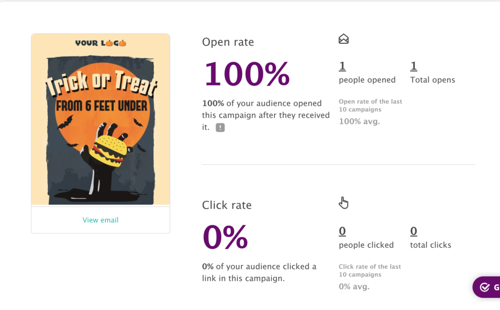
I sent out a Halloween Hamburger Joint template because my clean edit was lost and I couldn’t bother setting up a new one. (I guess you hope you can find the exact fit among that 700 template, I can’t imagine the pain of altering any of these templates)
The display of stats is really well done. You get a detailed overview of the performance of someone’s Hamburger promo email.
The price
– is what brought you to this cakeshop
The pricing is fantastic. Should be tought in SaaS schools. Small increments, a good starting price with a very generous FREE till 2k option, and the premium tier isn’t overpriced either.
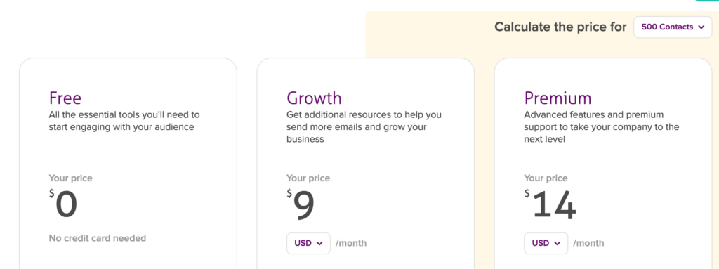
As a reference, the lite version cost is paired with MailerLite’s, being a bit more expensive than Brevo. Note that this will only give you an autoresponder drip sequence, with no tag-based triggers.
For a fully capable email marketing tool, you will need the higher tier, and that is around Buttondow’s, Mailchimp’s, and GetResponse’s base price on average under 10k.
The fee crosses a $100/mo at the 10k mark, but by then it wouldn’t matter, would it?
The final question is due.
Verdict – is cakemail your tool?
So, ✔ the price is great, ✔ features are fine, ✔ contact management is splendid, ⛆ automation is usable just mis-designed … but ✗ the editor is shit, ✗ forms and signup XP cannot be controlled.
And unfortunately, either of these two would be closing the door.
What you do – mostly do in an email tool is setting up emails. You’d likely write them elsewhere in Scrivener or iA or Notion…but eventually, you set it up here.
And I always find some small tweaks, and final polishes after I pasted the revised copy.
I don’t mind these after edits in Convertkit or Aweber. Love to write in Flodesk, often directly…it’s just that inviting. It’s even more pleasant for Audienceful or Buttondown, both basically give you a designated writing app within. Great editors lead to great emails.
But it’s a fucking torture in these Bee editors and all the shitty lookalike drag-n-drops, made by people who just wanted to check this hurdle off their SCRUM board, but never set up a promo or launch or proper sequence in their life.
I’d probably charge 5x extra for a client using these. Or drop the job altogether.
And the form limitations are also problematic. You may get around it by using API – but you shouldn’t have to. At least they should’ve been giving some options on where to send subs after signing up or after confirming.
Despite all the good things, despite the great pricing and that I love Canada, Cakemail is

What to use instead
Use Flodesk. It’s gorgeous. $19/mo for the first year, than $38/mo flat.
Where it should improve
- Throw out the Bee editor, and develop an inline selection based, with editable template elements like in Flodesk
- Add tag trigger links into the email
- Add stype options to the form builder
- Add customization to the optin flow
- The automation UX design could be better, but it’s not critical
